5 Feminine Color Palettes / Color Schemes
Blog
Introduction
Welcome to the SEO Martian blog where we delve into the world of color psychology and design aesthetics. In this article, we present five exquisite feminine color palettes or color schemes that can elevate your brand and captivate your audience. Whether you are designing a website, creating a logo, or planning your overall brand identity, these color combinations are carefully curated to evoke elegance, confidence, and femininity. Let's dive into the enchanting world of colors!
The Powerful Influence of Colors
Colors have a profound impact on our emotions, behavior, and perceptions. They possess the ability to communicate messages, evoke specific moods, and leave lasting impressions. Understanding the psychology of colors is crucial in creating a brand that resonates with your target audience. Through the selection of the right color palettes, you can convey the essence of your business, establish trust, and evoke the desired emotional response from your customers.
1. Elegant Blush
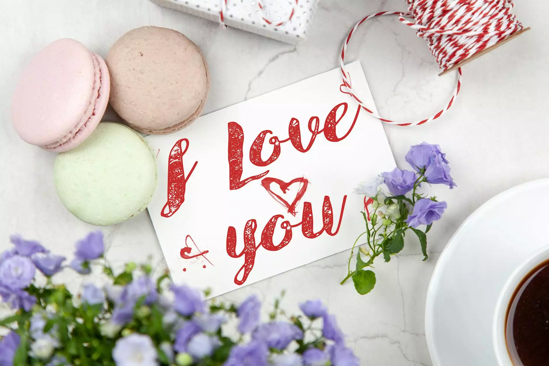
The Elegant Blush color scheme captures the softness and sophistication often associated with femininity. Comprised of delicate shades of blush, cream, and muted pastels, this palette exudes grace, charm, and subtlety. Whether used in a fashion brand, beauty blog, or wedding website, the Elegant Blush color scheme creates an atmosphere of elegance and refinement.
2. Serene Seafoam
Serene Seafoam offers a refreshing and calming color palette that resembles the hues of the ocean. With its blend of cool mint greens, soft cerulean blues, and hints of white or sand, this color scheme instills a sense of tranquility, balance, and serenity. It is perfect for promoting wellness products, interior design blogs, or websites related to travel and leisure.
3. Timeless Lavender
Lavender, long associated with luxury and femininity, is the dominant color in the Timeless Lavender color scheme. Combining regal purples with subtle lilac tones, this palette creates an aura of sophistication and creativity. Whether used in the beauty industry, home decor, or artisan crafts, the Timeless Lavender color scheme adds a touch of royalty and allure to any brand.
4. Harmonious Rose Gold
Rose Gold has become synonymous with elegance, modernity, and femininity. The Harmonious Rose Gold color scheme gracefully combines warm copper tones with gentle pinks, creating a luxurious and harmonious palette. This color scheme is especially popular in the fashion, jewelry, and lifestyle sectors, as it embodies a sense of opulence and refinement.
5. Delicate Coral
The Delicate Coral color scheme embraces the warm and inviting nature of coral tones. Combining gentle peach and apricot hues with hints of warm terracotta, this palette conveys a sense of playfulness, optimism, and friendliness. It is a fantastic choice for brands that want to exude energy and approachability, such as food blogs, children's products, or lifestyle publications.
Why Choosing the Right Color Palette Matters
Selecting the right color palette for your brand is crucial to make a memorable and impactful impression on your target audience. The colors you choose should align with your brand's personality, values, and target market. By carefully considering the emotions and associations evoked by different color combinations, you can create a cohesive and visually appealing brand identity that stands out in a competitive market.
In Conclusion
We hope this article has inspired you with our collection of five exquisite feminine color palettes. Whether you prefer the elegance of blush, the tranquility of seafoam, the sophistication of lavender, the luxury of rose gold, or the cheerfulness of coral, each color combination has its unique appeal. Remember, the right color scheme can captivate your audience, strengthen brand recognition, and create a lasting impression. So go ahead and elevate your brand with these stunning feminine color palettes!


